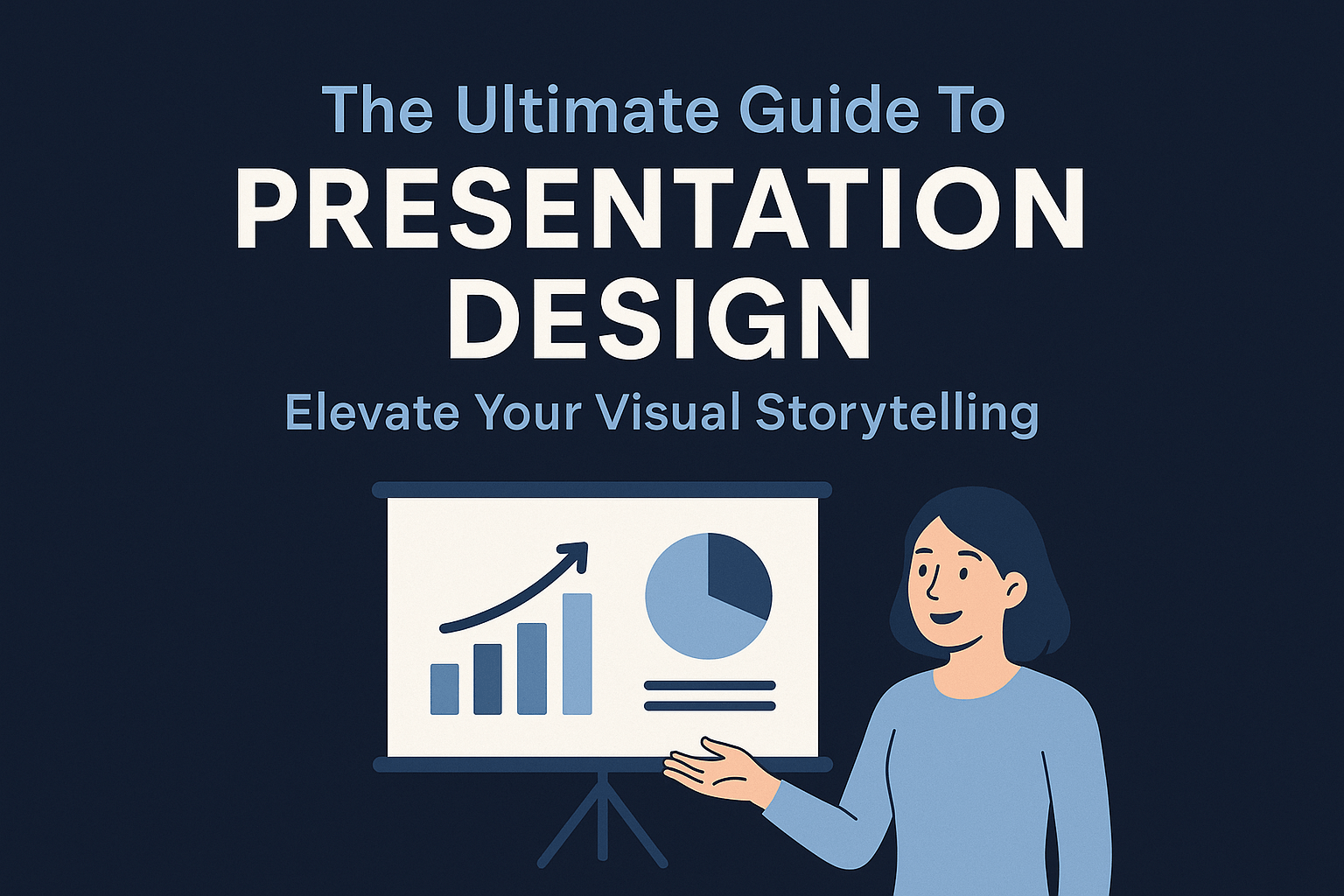
In today’s fast-paced business world, a well-designed presentation can be the difference between winning a client and losing their attention.
Presentation design services go beyond just creating slides. They transform ideas into visually compelling narratives that engage, inform, and persuade.
Whether you’re pitching to investors, training employees, or speaking at a conference, a professionally designed presentation ensures your message stands out.
But what exactly makes a presentation effective?
And how can you choose the right design service for your needs?
This guide will cover:
✔ Why professional presentation design matters
✔ Key elements of an effective presentation template
✔ How to choose the right presentation design service
✔ Top tools to enhance your presentations
✔ Best practices for audience engagement
Let’s dive in!
Why Professional Presentation Design Matters
1. First Impressions Count
- Research shows that audiences form an opinion within 7 seconds of seeing your slides
- A polished, well-structured presentation immediately conveys credibility and professionalism
- Poorly designed slides can undermine even the strongest content
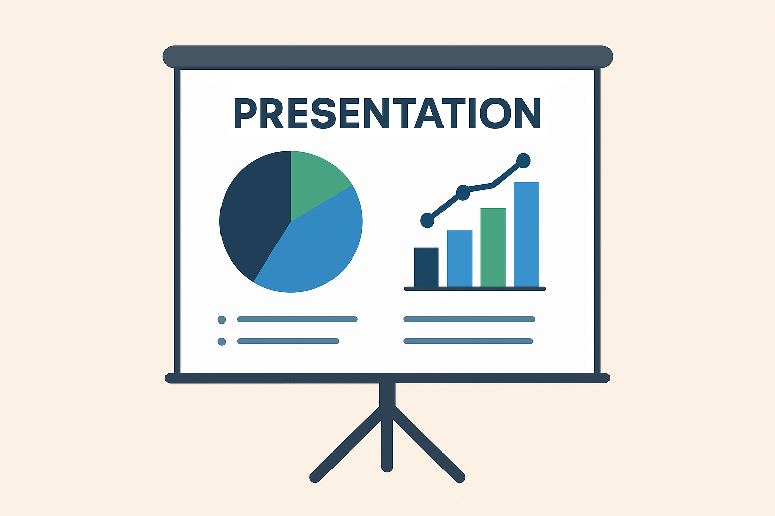
2. Simplifies Complex Information
- Transforms data-heavy content into digestible visuals
- Uses infographics, charts, and icons to improve comprehension
- Helps audiences grasp key points 60% faster than text alone
3. Boosts Engagement & Retention
- People remember 65% of information when paired with visuals vs. 10% from text alone
- Strategic use of color increases readership by 80%
- Animations and transitions can highlight key points effectively
4. Strengthens Brand Identity
- Ensures consistent use of brand colors, fonts, and messaging
- Creates visual recognition across all company materials
- Builds trust and professionalism with stakeholders
Want to be an amazing Public Speaker?
5. Saves Time & Resources
- Eliminates hours spent struggling with templates
- Allows focus on content and delivery rather than design
- Professional designers can work 3-4x faster than amateurs
6. Competitive Advantage
- Sets you apart in pitches and proposals
- Makes your message more memorable and shareable
- Can be the deciding factor in winning new business

How to Choose the Right Presentation Design Service
With so many agencies and freelancers offering design services, how do you pick the best one?
1. Check Their Portfolio
Look for:
✔ Variety in design styles
✔ Experience in your industry
✔ High-quality visuals
2. Read Client Testimonials
- Were past clients satisfied?
- Did the agency meet deadlines?
3. Compare Pricing & Value
- Avoid the cheapest option (quality may suffer)
- Look for packages that fit your budget
4. Custom vs. Template-Based Design
- Custom design = Unique, brand-specific (best for high-stakes pitches)
- Template-based = Faster, more affordable (good for internal meetings)
5. Communication & Revisions
- Does the agency offer revisions?
- How responsive are they to feedback?
Daily Practice Routine for Public Speaking
Key Elements of an Effective Presentation Template
Not all presentation templates are created equal.
Some make your content shine effortlessly; others distract or confuse your audience. A well-crafted presentation template isn’t just about looking pretty.
It’s a powerful tool for delivering your message with clarity, professionalism, and impact.
Below are the key elements every effective presentation template should have, with deeper insights into what makes each one work.
1. A Flexible Layout
A good presentation template should adapt seamlessly to different kinds of content.
Key Points:
- ✅ Adaptable Slide Types: Include templates for title slides, section headers, bullet points, image-only slides, data-heavy content, and quote slides.
- ✅ Consistent Spacing & Alignment: Ensure padding, margins, and spacing are uniform across all slides—this makes the presentation feel cohesive and professional.
- ✅ Grid-Based Design: A built-in grid or column system keeps everything visually aligned and balanced.
- ✅ Placeholder Text & Imagery: Use pre-defined, editable placeholders that guide users without locking them in.
Why it matters: Flexibility allows the same template to be used for a pitch deck, training session, webinar, or report by saving time and maintaining brand consistency.
2. Brand-Aligned Color Scheme & Typography
Your presentation should feel like an extension of your brand.
Key Points:
- 🎨 Brand Colors: Use your primary and secondary brand colors strategically (headings, backgrounds, accent elements).
- 🔤 Readable Fonts: Stick to clean, legible fonts (sans-serif usually works best). Use 1-2 fonts consistently for headings and body text.
- 🎯 Hierarchy with Font Weights/Sizes: Establish visual hierarchy through bolding, sizing, and color—not font overload.
- 🟩 Accessible Color Contrast: Ensure text stands out against background colors for better readability, especially for people with visual impairments.
Why it matters: Brand-aligned visuals build trust and recognition while keeping your slides professional and visually unified.
Voice Exercise for speaking clearly
3. Clear Visual Hierarchy
Good templates guide the audience’s eyes to what matters most.
Key Points:
- 🧭 Defined Headings & Subheadings: Differentiate sections clearly with font size, weight, and color.
- 🔎 Highlight Key Messages: Use bold, color, or design elements (like shapes or icons) to emphasize the most important points.
- 📊 Order of Elements: Place titles at the top, followed by supporting visuals and descriptions in a consistent flow.
- ⏳ Logical Slide Progression: Slide sequences should build your narrative step-by-step and not feel disjointed.
Why it matters: A clear structure prevents information overload and keeps your audience engaged throughout your presentation.
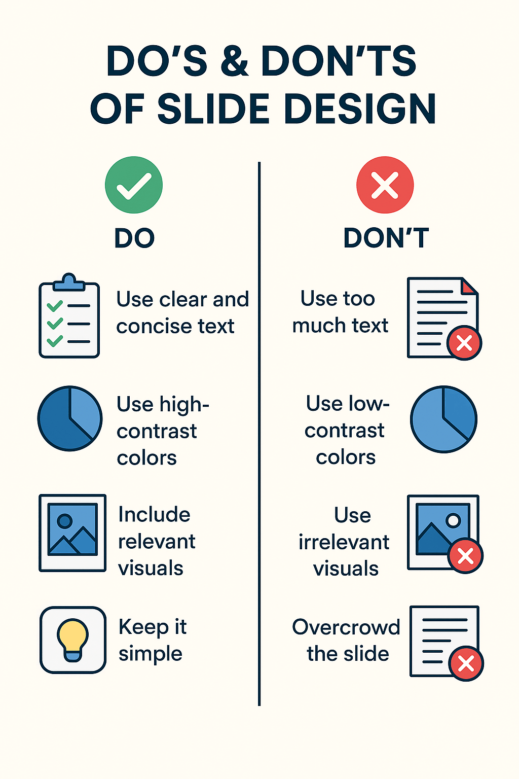
4. Engaging Visuals
Visual storytelling enhances understanding and memory retention.
Key Points:
- 🖼️ High-Quality Images: Use professional, relevant, high-resolution photos that match your tone (e.g., inspirational, corporate, educational).
- 🧩 Icons & Illustrations: Replace long lists or text with visual symbols to increase clarity and reduce visual clutter.
- ✂️ Whitespace Usage: Leave breathing room around text and images—don’t cram everything in one slide.
- 📝 Minimal Text Per Slide: Use bullet points or keywords. Stick to one idea per slide where possible.
- 📈 Visual Data Representation: Use charts, graphs, and infographics that are easy to interpret and visually appealing.
Why it matters: Visuals boost attention, simplify complex ideas, and keep the audience focused without tiring their eyes.
5. Seamless Transitions & Subtle Animations
Movement should enhance—not distract from—your message.
Key Points:
- 🎥 Consistent Slide Transitions: Apply the same transition (e.g., fade, wipe) across slides for a smooth, professional look.
- 🧠 Purposeful Animations: Use animations to control information flow—e.g., revealing bullet points one at a time.
- 🚫 Avoid Overuse: Skip flashy, bouncing, or spinning effects that look unprofessional and annoy viewers.
- ⏱️ Timing & Speed: Keep animation speeds quick and transitions under 1 second for a snappy experience.
- 📱 Mobile/Export-Friendly: Ensure transitions work well even when exported as a PDF or viewed on mobile devices.
Why it matters: Well-placed transitions help your audience follow along, while excessive motion distracts and weakens your message.
6. Built-In Accessibility Features
Not every audience member consumes content the same way. Accessibility matters.
Key Points:
- 🎧 Alt Text for Images: Allow users to add alternative descriptions for visuals.
- 🎯 Readable Font Sizes: Stick to at least 18–20pt font sizes for body text and 28–36pt for headings.
- 🌈 Color Contrast: Avoid red-green combinations and ensure that all content is visible in grayscale.
- 🖥️ Keyboard Navigation Compatibility: Especially if the presentation will be shared as a file.
Why it matters: Accessibility ensures your message reaches everyone—regardless of ability or viewing environment.
7. Bonus: Template Extras That Add Serious Value
Standout templates often go the extra mile. Here are a few bonus elements that level up usability:
- 📌 Editable Infographics & Timelines
- 📋 Table Formats & Comparison Slides
- 📢 Call-to-Action (CTA) Slide Layouts
- 🧭 Agenda & Summary Slides
- 🎯 Icons Library or Style Guide
- 🎓 Instructions or Usage Notes (hidden slide)
Impromptu Public Speaking Topics
Best Public Speaking topics for every age
Top Presentation Tools to Enhance Your Slides
1. PowerPoint (Best for Business)
✔ Most widely used
✔ Advanced animation features
2. Google Slides (Best for Collaboration)
✔ Real-time editing
✔ Cloud-based access
3. Keynote (Best for Apple Users)
✔ Sleek, modern templates
✔ Smooth animations
4. Canva (Best for Beginners)
✔ Drag-and-drop editor
✔ Thousands of free templates
5. Prezi (Best for Non-Linear Storytelling)
✔ Zoomable, dynamic presentations
✔ Great for creative pitches
How to Use Generative AI tools for Public Speaking
AI tools that help Public Speaking
Best Practices for Audience Engagement

Captivating your audience during a presentation isn’t just about what you say—it’s how you say it, how you involve them, and how relevant your content feels to them.
Whether you’re presenting to a team, pitching to clients, or teaching a class, here are tried-and-true best practices for audience engagement that turn passive listeners into active participants.
1. Tell a Story
Humans are wired for stories. A well-told story creates emotional connection and keeps attention high.
Key Techniques:
- 📖 Follow a Narrative Arc: Start with a problem → introduce struggle → offer a solution → end with a result.
- 🧑🤝🧑 Use Real-World Examples: Share relatable stories, personal anecdotes, or customer experiences.
- 💥 Use Tension & Curiosity: Ask thought-provoking questions or introduce unexpected facts to draw people in.
Pro Tip: Make your audience the hero of the story. Position them as the ones overcoming challenges through your insights or solutions.
How to Create Authenticity in Storytelling
2. Use High-Quality Visuals
Visuals should support your message, not distract from it.
Visual Engagement Best Practices:
- 🖼️ Avoid Pixelated or Stretched Images: Stick to high-resolution photos and vector graphics.
- 🧩 Use Icons for Quick Recognition: Replace blocks of text with clear, recognizable icons.
- 🎨 Consistent Design Style: Use a cohesive color palette, illustration style, and font pairing.
- ✂️ Use Visual Metaphors: Help explain abstract concepts with familiar images or analogies.
Why it works: Clean, relevant visuals reduce cognitive load and increase retention.
Incorporating Visual Storytelling In Content Creation
3. Keep Text Minimal
No one wants to read slides—they want to hear from you.
Minimal Text Guidelines:
- 🔢 Use the 6×6 Rule: No more than 6 words per line and 6 lines per slide.
- ✔️ Bullet Points: Use sparingly—focus on keywords, not full sentences.
- 🎯 One Key Message per Slide: Don’t try to say everything at once.
- 🧠 Use Speaker Notes: Put detailed points in your notes, not on the slide.
Pro Tip: If your slides work without you explaining them, you probably have too much text.
4. Incorporate Interactive Elements
Engaged audiences don’t just watch, they participate.
Ways to Interact:
- 📊 Live Polls & Word Clouds: Use tools like Mentimeter, Slido, or Kahoot to collect opinions or feedback in real-time.
- 🙋 Q&A Segments: Schedule short Q&A breaks during the presentation—not just at the end.
- 🧠 Quick Think-Pair-Share Activities: Ask the audience to reflect or discuss with a neighbor for 30–60 seconds.
- 🗳️ Raise Hand / Emoji Reactions (in virtual sessions): Encourage light interaction to keep energy up.
Why it works: Interaction breaks monotony and makes content feel relevant and dynamic.
5. Practice & Refine Delivery
You might have amazing slides—but how you deliver them makes all the difference.
Delivery Best Practices:
- 🗣️ Rehearse Out Loud: Practice in front of a mirror, or record and listen to your delivery.
- 🧪 Test with a Sample Audience: Present to a colleague or friend and ask for honest feedback.
- 🎭 Work on Voice Modulation & Pauses: Use tone, pace, and pauses to emphasize important points.
- 📷 Practice Eye Contact (or Camera Presence): In virtual settings, look into the camera lens, not just your screen.
Final Polish Tip: Have a backup plan for tech failures—always keep a PDF version of your slides and know your material well enough to go without them if needed.
6. Use Humor & Emotion (Where Appropriate)
Humor and emotion help audiences connect and remember your message.
Ideas:
- 😂 Use Light Humor or Relatable Jokes: Especially to break the ice at the start.
- ❤️ Tap into Emotions: Inspire, excite, or empathize—stories or visuals that spark feelings tend to stick.
- 😅 Be Authentic: Even small, personal stories can help humanize you and make you more relatable.
Caution: Avoid sarcasm or controversial humor, especially with unfamiliar audiences.
How To Use Humor And Storytelling In Public Speaking : A Winning Combination
7. Keep a Dynamic Pace
Monotony is the enemy of attention. Keep the energy flowing.
Tips:
- ⏰ Change Slide Types Often: Mix text slides with visuals, quotes, data, or videos every few minutes.
- ⌛ Segment Content into 5-7 Minute Chunks: Our attention spans are short—mini breaks or topic shifts help.
- 🎬 Use Short Video Clips: Videos (under 90 seconds) can re-engage attention and reinforce points.
8. End Strong With a Call to Action (CTA)
The closing of your presentation should inspire action or leave a lasting impression.
Ideas:
- 🚀 Summarize Key Takeaways Clearly
- 🎯 Share a Call to Action: What should the audience do next? Visit a link? Start a habit? Ask a question?
- 🙏 End with Gratitude & Openness: Thank the audience and invite follow-up conversations.
Why it works: A strong ending ensures your audience walks away motivated and informed—not just entertained.
Final Thoughts
A well-designed presentation isn’t just about aesthetics, it’s about communicating your message effectively. By leveraging professional design services, using the right tools, and following best practices, you can create memorable, impactful presentations that drive results.
If you found this post helpful, don’t forget to share it with a friend who could use a little articulation boost!
Disclosure: If you click on the affiliate links provided in this article and purchase the product, I will receive a commission from the company of the product. You will not pay anything extra for your purchase. You can read the affiliate disclosure for more information.

10 thoughts on “The Ultimate Guide To Presentation Design: Elevate Your Visual Storytelling”
This is such a great guide for making presentations stand out. The tips on visuals and audience engagement are super helpful for keeping people interested, i learnt soo much things for your post thanks for sharing dear.
Thank you!
Hey a great post you have here!
I enjoyed this post as not only does it get straight to the point, it is easy to read and understand as well as remember.
As you can tell picking out a well presentation is essential like you have mentioned audience already make up their decision in the first few seconds of viewing the page.
Thanks again and have a great day!
Effective presentation design is often overlooked, yet it can make or break how an audience receives your message. I’ve found that even strong content can fall flat without the right visual structure and flow. How do you balance visual creativity with brand consistency, especially for clients with rigid corporate templates? Also, how do you handle cases where the speaker’s style doesn’t match the tone of the design? I’ve experienced situations where the presenter was dynamic, but the slides were too formal, creating a disconnect. Do you usually adapt the design to the speaker’s personality or focus more on the audience type?
Hi Kavitha, I appreciated the focus on visual hierarchy and brand alignment, which are often overlooked but critically important for maintaining professionalism and clarity. The breakdown of adaptable slide types, spacing consistency, and accessible font usage was insightful it really shows how design isn’t just about aesthetics, but about function and inclusivity. The attention to accessibility, such as color contrast and keyboard navigation, is a commendable addition that reflects today’s growing awareness of diverse audience needs. If I may ask, do you recommend any agencies or freelancers that specialize in brand-consistent custom presentation design?
Thank you for your thoughtful feedback. I’m so glad the design principles resonated with you! I’ll be happy to recommend a few reliable design experts who specialize in brand-consistent presentations.
Hi Kavitha,
Reading “The Ultimate Guide to Presentation Design” made me realize what a great article it is.
As someone who has spent far too many nights struggling with messy slides, your advice felt like a warm embrace of clarity. The research-backed statistics (like graphics increasing retention by 65%!) were eye-opening, and the breakdown of the template’s elements—especially the emphasis on accessibility and flexible layouts—was pure gold.
I’ve always underestimated transitions, but your note about keeping them “fast and to the point” is something I’ll steal for my next presentation. And that “6×6 rule”? Savior. My slides used to look like drafts of essays—not anymore!
One thought: I’d love to hear how you balance creativity with professionalism in high-stakes presentations. Any horror stories or quick fixes?
Thank you for making planning seem accessible and fun. You turned my presentation fear into excitement!
Regards,
Mitia
Thank you so much, Mitia! Balancing creativity with professionalism comes down to clean visuals + story flow, and yes I’ve had last-minute “too much text” slides I fixed by simplifying to one key idea per slide.
The breakdown of different presentation design service tiers is particularly useful – the distinction between basic template customization and full storytelling development helps set realistic expectations for clients. Your example of transforming dense financial data into visual narratives shows the real value of professional services.
Clients often underestimate how much time they actually spend wrestling with slide layouts when they could be focusing on content refinement instead.
You mentioned the importance of designer-client collaboration – what’s your process for ensuring the designer fully understands the presenter’s unique voice and style? For technical subjects, how do you balance aesthetic appeal with maintaining precise accuracy in data visualization?
Great questions! I usually start with discovery calls to capture the presenter’s voice, and for technical data I prioritize clarity first, then layer in clean visuals.